

This article explains how to monitor your campaign results using general reports and describes how Snov.io calculates key statistics.
The campaign analytics and statistics data presented on the Reports dashboard is also available via API. Learn more.
The Reports page helps you monitor key campaign metrics and important account statistics, all conveniently displayed in a single dashboard.
Why the Reports dashboard is useful for you:
By reviewing the campaign reports in your account, you can:
- View overall stats during the active phase of campaigns and track progress towards goals.
- Do post-campaign analysis to adjust your strategy for future campaigns.
It will help you answer these questions:
- What are the overall statistics of your campaigns in Snov.io?
- Which campaigns are driving the most engagement?
- Which accounts are performing best?
- Which team members show the best results?
How to access Reports
To access the reports in your account, go to the Campaigns tab in the top menu. Then, choose Reports in the submenu that appears on the left.
The dashboard lets you switch between channels to view statistics for:
- Email: Shows data from cold email and multichannel campaigns that include at least one Email step.
- LinkedIn: Displays data from LinkedIn automation and multichannel campaigns that include at least one LinkedIn action.
- General: Combines data from email campaigns, LinkedIn automation, and multichannel campaigns.

Filter data in reports
To adjust the data in the report, use the dropdown menus at the top and apply the necessary filters. You can select which campaigns, email accounts or LinkedIn accounts, and team members to include in the report.
1) Campaigns
By default, the report displays data from all your campaigns, regardless of their status (active, completed, or deleted). You can choose the specific campaigns that you want to include in the report.
2) Accounts
By default, the report includes data from all your accounts and your team members' accounts. You can choose which sender accounts will be included in the report data and shown in the Accounts section.
3) Owners (for Teams)
In Teamwork accounts, the report will include data from team members' campaigns and their email accounts. The list includes all team members, regardless of whether they have started a campaign.
If you're a team leader (admin), you can choose which members to include in the report and display in the team performance section.
4) Date range
By default, the dashboard shows statistics from the last 30 days. You can choose a date range ("Today," "Last 7 days," "Last 30 days," or a custom) to see how your campaigns performed during that specific time.
All filters work together. When you apply one filter, the others automatically adjust to show only relevant results.
For example, if you choose Email Account 1 and Email Account 2, only campaigns that use those accounts will be included in the report.
How we calculate Email reports
The Email report has several sections that cover all the important aspects of the campaign.
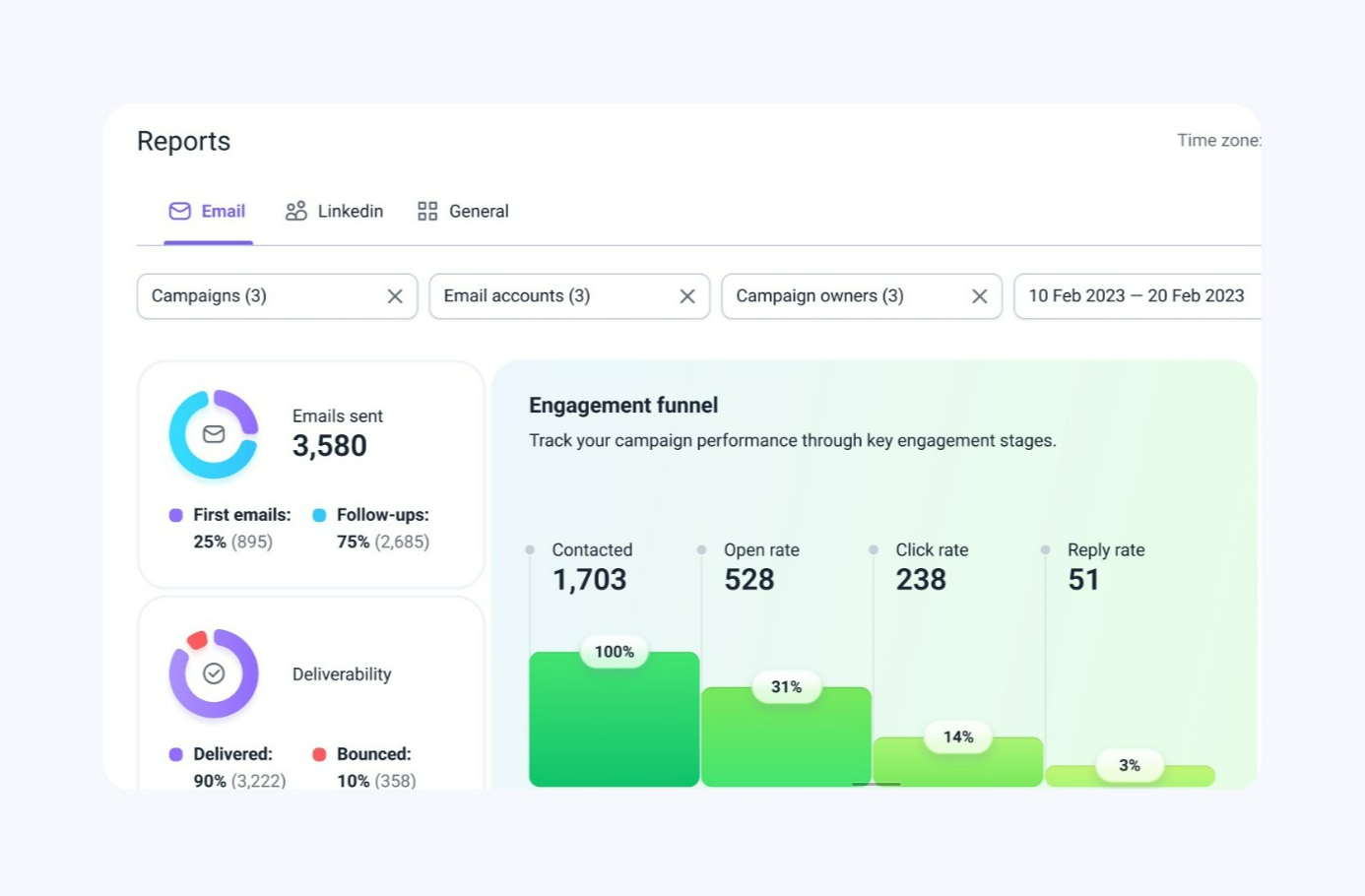
Campaign volume statistics
This section provides information about the total volume of your campaigns. It shows how many of the emails sent are initial (first emails) and how many are follow-ups.
- Emails sent: Total number of emails sent to prospects from selected campaigns. This does not include single emails sent from individual prospect profiles -->
- First emails: The number of initial emails sent, indicating how many prospects you've reached at least once.
- Follow-ups: The number of emails sent from all subsequent steps in the sequence.

If you notice that you are sending more follow-up emails than initial emails, and this isn't effective for your strategy, you can set the priority in your campaign settings to send more first emails.
Read more: How to prioritize first emails over follow-ups →
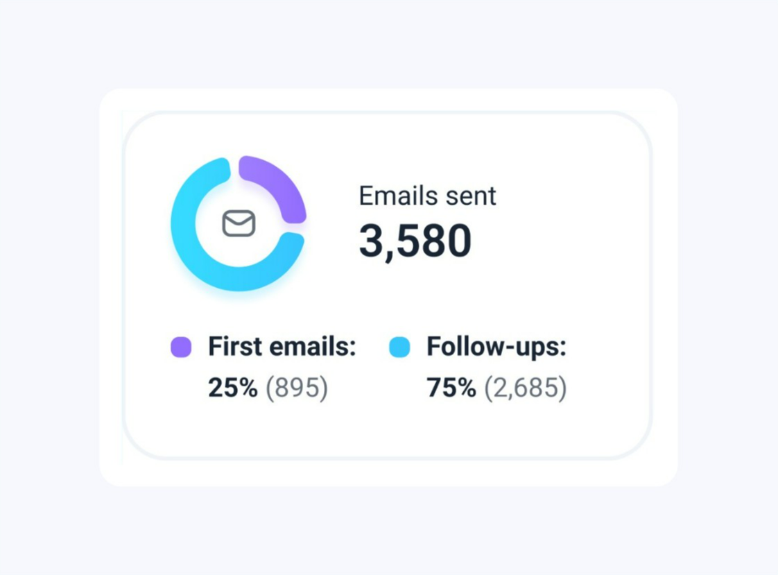
Deliverability statistics
This section provides information about your deliverability rate and shows the percentage of emails that were successfully delivered.
- Delivered: The percentage of emails sent that reached the recipient’s email address.
Even if an email is delivered, it might not always reach the inbox—it could end up in the spam folder. Since it's not possible to track exactly where emails land in real campaigns, use the Deliverability Check → to test email placement before launching campaigns.
- Bounced: This metric tracks the percentage of emails that could not be delivered to the recipient’s email address →
High bounce rates (above 10%) can indicate issues with your email list. Here’s the checklist to prevent high number of bounces -->
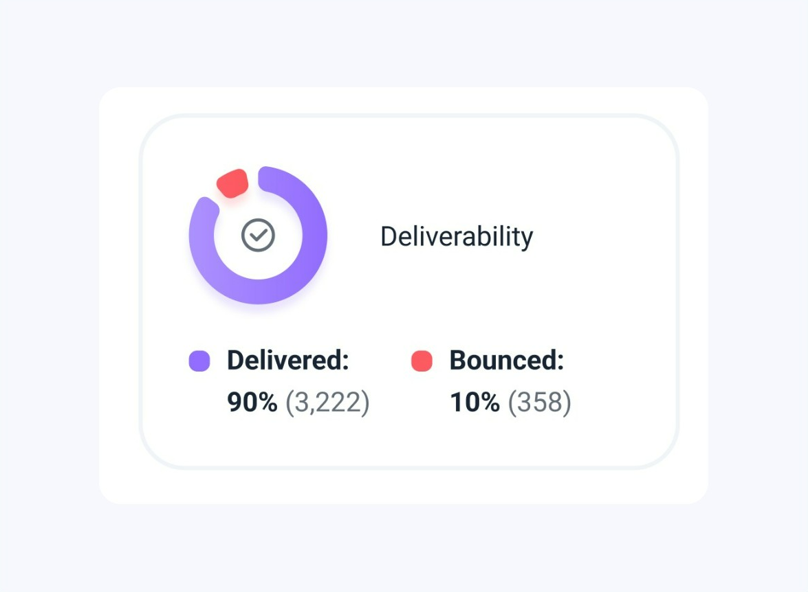

Engagement statistics
This section shows the number of leads contacted through selected campaigns and how they interacted with your emails. It includes metrics such as opens, clicks, and replies.

- Contacted: The total number of prospects who have received at least one email from your campaigns.
- Open rate: The number and percentage of recipients who opened your email at least once in any of the selected campaigns. Only unique opens are counted; repeated opens are not included.
- Click rate: The number and percentage of recipients who clicked on at least one link in your campaigns.
- Reply rate: The number and percentage of recipients who replied to at least one of your emails across all selected campaigns.
When calculating the reply rate, we use the date the email was delivered rather than the time when the recipient actually replied to it. Consider this when checking statistics for specific dates.
A low reply rate (below 2-3%) indicates that your email content may need improvement. Best practices to get more replies.
How we calculate statistics:
Engagement rates are calculated based on the Contacted number, which is considered 100%. For example, the open rate represents the percentage of recipients who opened the email compared to the total number of contacted prospects.
Potential value
Track potential revenue from campaigns in the Reports dashboard.
This metric shows the total value of all deals created from your campaigns.
It includes:
-
Deals you created manually from the recipient list
-
Deals automatically generated through CRM automation
The total is calculated by summing the values of all deals from campaigns included in the report.
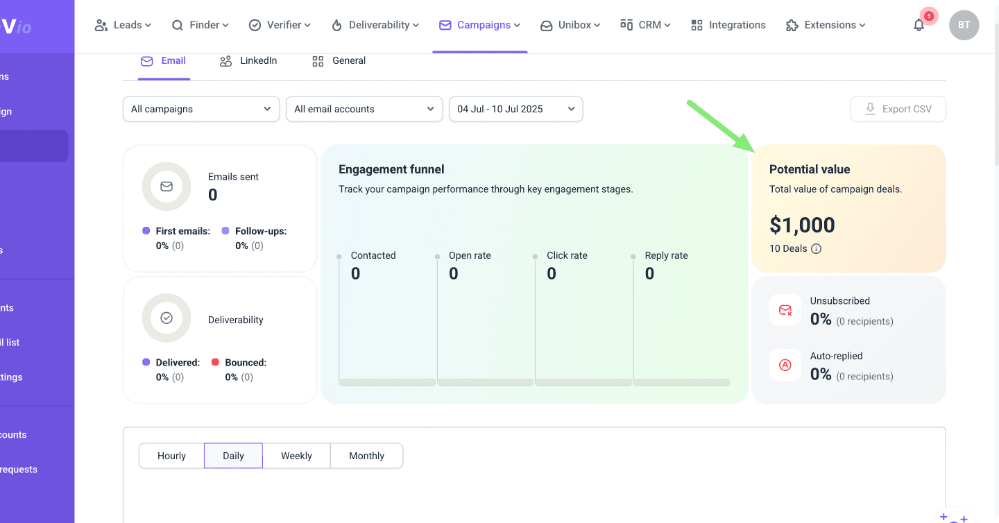

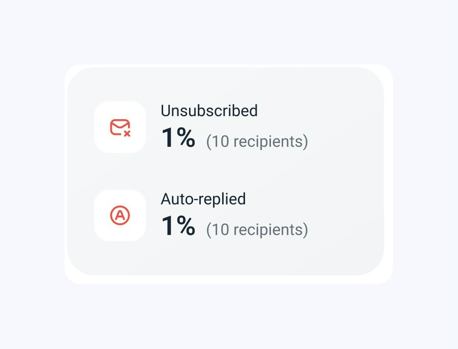
Not reached statistics
This section shows how many prospects were either not interested or were contacted while they were out of the office.
- Unsubscribed: The number and percentage of recipients who clicked the Unsubscribe link in your campaigns and therefore opted out from receiving your emails.
The unsubscribe rate shows how many people opted out of your emails. It helps you understand if your offer is relevant to your prospects and if you’re contacting the right people.
If your unsubscribe rate is high (above 1-2%), it may indicate that your offer isn’t resonating with your recipients or that your targeting needs adjustment. To address this, review and refine your customer profiles and criteria for collecting prospects.
Additionally, consider increasing the delay between follow-up emails to reduce unsubscribe rates.
- Auto-replied: The percentage of recipients who were out of the office at the time of receiving the email and sent an auto-reply.
A high number of auto-replies might indicate that your emails are being sent outside the recipients' working hours. To reduce the number of auto-replies, adjust your campaign schedule to align with the recipients' working hours based on their time zones.

Campaign activity chart (Email)
This section of the report visualizes recipient actions and campaign events over time. The chart displays trend lines for the metrics you select, reflecting their volume over the chosen time period.
To adjust data in the chart:
1) Select a time period at the top. Based on the time frame you choose, the chart will be divided into sections (hours, days, weeks, or months), showing the volume of activities throughout that period.
A shorter time frame (hourly, daily) shows short-term trends. A longer period (weekly, monthly) shows broader patterns in your outreach.
2) Choose metrics (data points) from the options at the bottom. The chart will show them side by side, helping you compare their volumes.

The chart displays activities based on when they occurred, not when the related email was sent.
The data points you select will be shown on the chart, indicating the time period in which they occurred and their volume (number of actions). Hover over the colored area to view details.
What are the data points for Email activity chart:
- Emails sent: The total number of emails sent during the selected time period.
- First emails: The number of initial emails sent from a sequence.
- Follow-ups: The number of follow-up emails (2nd, 3rd, 4th, etc.) sent from a sequence.
- First opens: The number of times recipients opened an email from the sequence for the first time.
- First clicks: The number of times recipients clicked a link in an email from the sequence for the first time.
- Total unique opens: Counts each recipient’s first email open within the selected time period (Daily, Weekly). Multiple opens by the same recipient in a day count as one.
- Total unique clicks: Counts each recipient’s first link click within the selected time period (Daily, Weekly). Multiple clicks on the same link in a day count as one.
- Replies: The number of replies received from prospects.
- Unsubscribes: The number of recipients who clicked the unsubscribe link.
- Auto-replies: The number of automated responses received.
- Bounces: The number of email delivery errors that were tracked into the report.
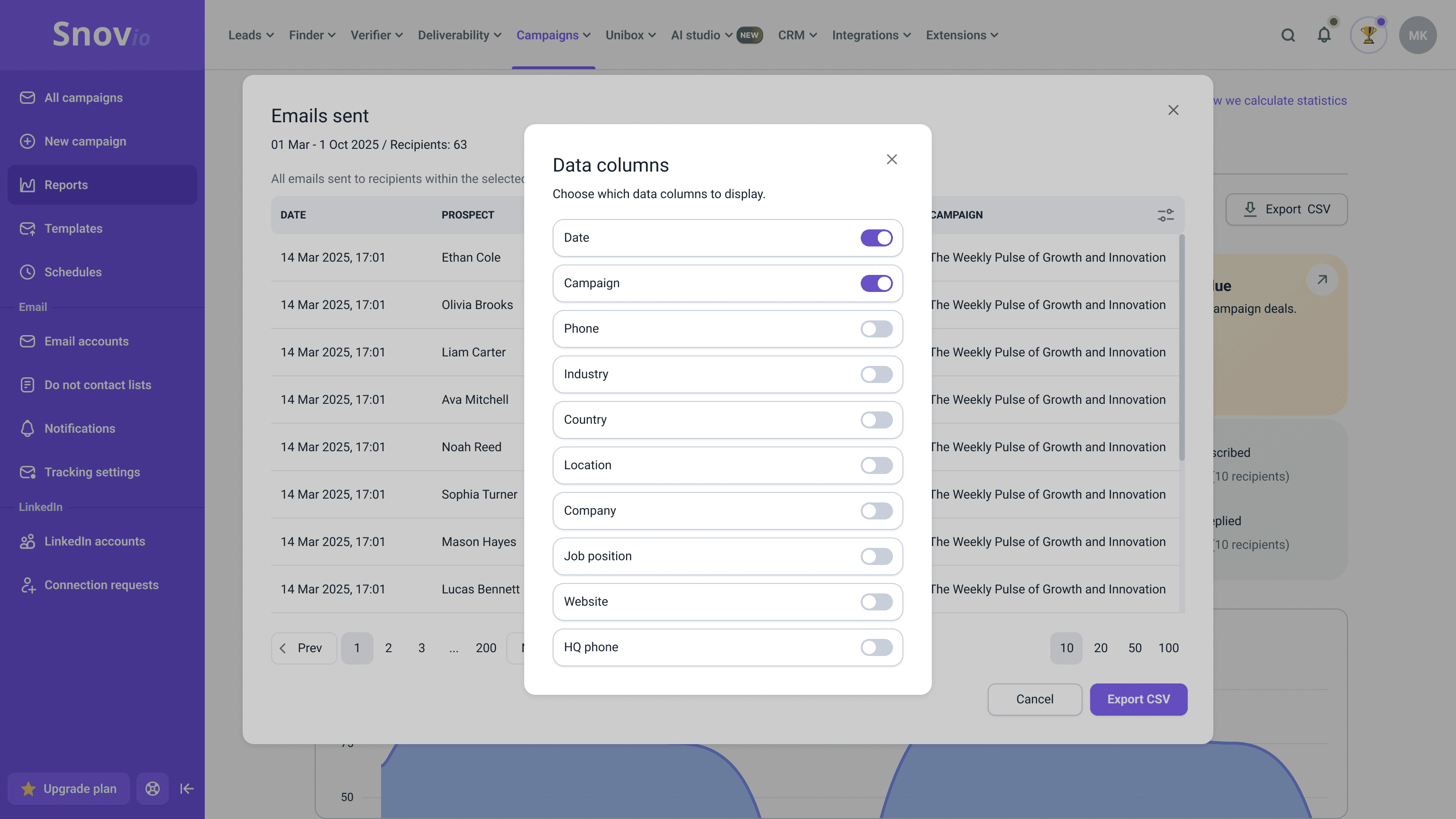
You can export the list of recipients for each metric. Click View recipients to open the list of prospects tied to that metric, then download it.
To choose which recipient data appears in the final export, enable the columns you need from the Data columns menu in the top-right corner.
You can include the following recipient fields in the export:
-
Phone
-
Industry
-
Country
-
Location
-
Company
-
Job position
-
Website
-
HQ phone

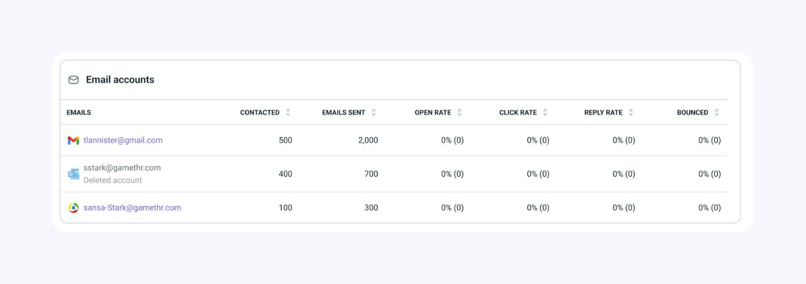
Check email account statistics
This section of the report displays statistics for your email accounts. If you haven’t applied any account filters, the list will show all accounts you've connected to Snov.io, including those not used for sending campaigns or those that were deleted after sending a campaign.
This allows you to track statistics for each email account and sort them to identify which have the highest volumes and best results, as well as those that are underperforming.

Review team statistics
This section shows each team member's contribution to the overall results. It combines statistics from all campaigns they have launched.
By default, the list shows all team members, including those who haven't launched a campaign. To include specific team members in the report, use the Campaign Owners filter at the top.
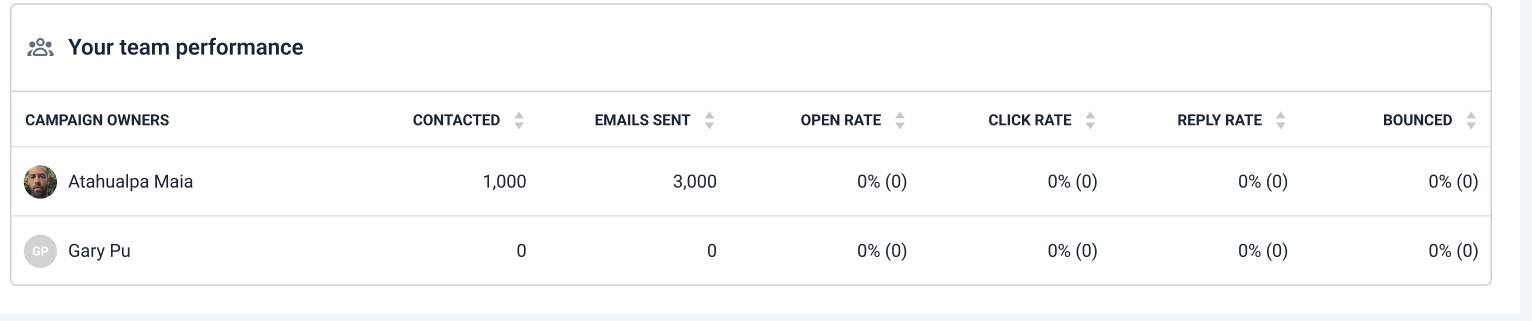

Only team leaders and team members with the "View team records" permission can see the statistics of other team members. Team members without permission will only be able to view the statistics for their own campaigns.
How we calculate LinkedIn reports
To track the overall statistics of your LinkedIn automation, switch to the LinkedIn tab on the Reports dashboard. It provides data on the total volume and success rate of interactions with leads on LinkedIn.
Statistics in the LinkedIn report are based on the selected campaigns, accounts, and time period. By default, it shows data from all campaigns and accounts for the last 30 days. You can customize this using the filters at the top.
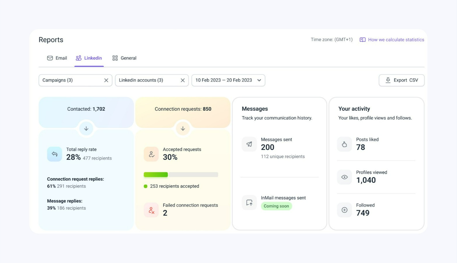

The report has several sections that display data on all key aspects of your LinkedIn outreach: lead volume, engagement rate, activity timeline, and statistics per account.
Leads engaged
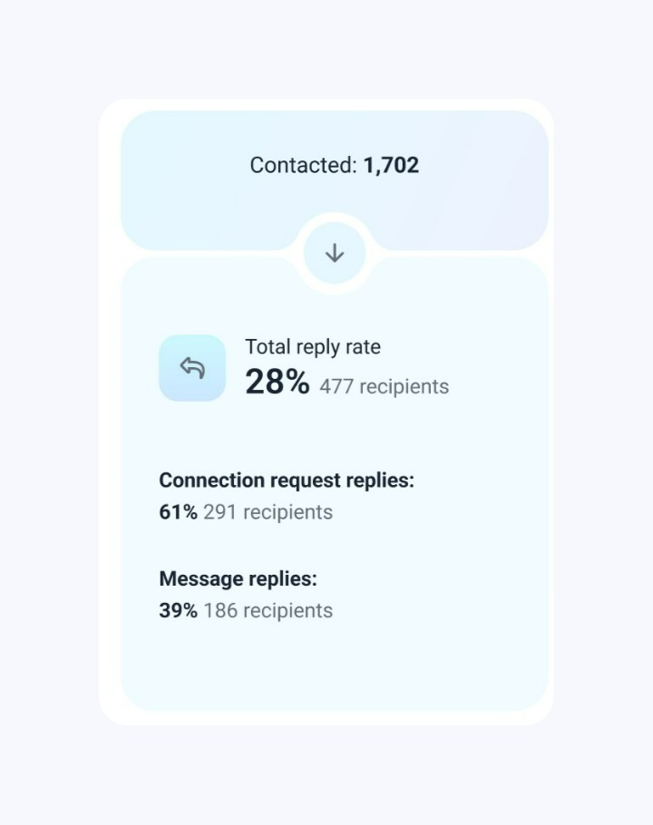
In this section, you can monitor two crucial outreach aspects: how many leads you’ve engaged within a selected time period and how many of them have replied.
When selecting the time period, keep in mind that the reply rate is based on when the message was sent, not when the reply was received.
- Contacted: The number of prospects to whom you sent at least one message or connection request on LinkedIn.
- Total reply rate: The percentage and the number of recipients who replied at least once to any of the messages sent on LinkedIn.
The total rate consists of replies to regular LinkedIn messages and replies to messages added to connection requests. If a prospect replies to both of them, we'll count this prospect in the “Connection request replies statistics”, as the reply to the request occurred first.

Acceptance rate and account growth
This section helps you monitor data on the connection requests sent during the selected time period.
- Connection requests: This is the total number of connection requests sent to prospects in your Snov.io campaigns.
- Accepted requests: This metric shows the percentage of total requests that were accepted by their recipients.
The acceptance rate is important as it indicates how many prospects are interested in further communication. Additionally, the number of accepted requests reflects network growth, showing how many prospects you can contact (send LinkedIn messages to) in future campaigns.
- Failed connection requests: This metric shows the number of connection requests that were not completed.
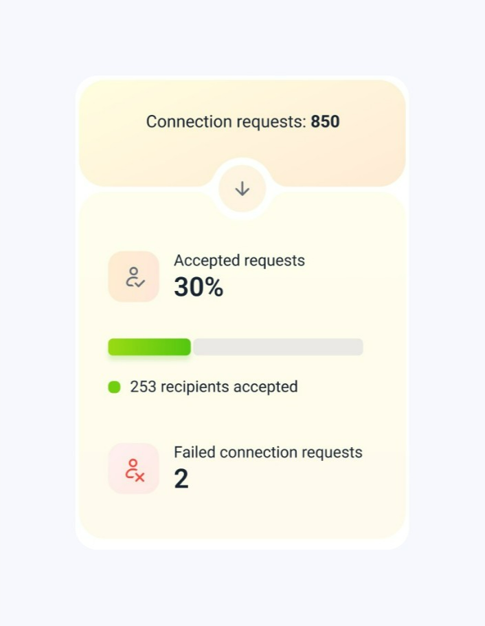

A failed request doesn’t necessarily indicate a technical issue on Snov.io’s end; there could be various reasons for the failure. Possible reasons include:
- The prospect’s LinkedIn profile doesn’t exist
- You previously sent a connection request to this prospect, which was either rejected or remains pending.
- The prospect is already in your network.
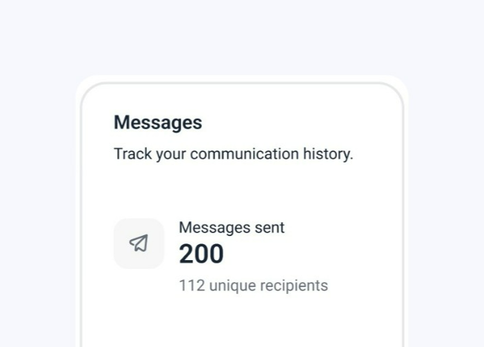
Message volume
In this section of the report, you can track the overall volume of messages sent in your campaigns.
- Messages sent: The total number of messages sent to prospects on LinkedIn, including both regular messages and those sent with connection requests. Unique recipients refers to prospects who received at least one LinkedIn message.
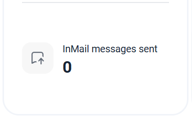
- InMail messages sent: Indicates the total number of InMails sent to prospects in the selected campaigns where an InMail action was added to the sequence.


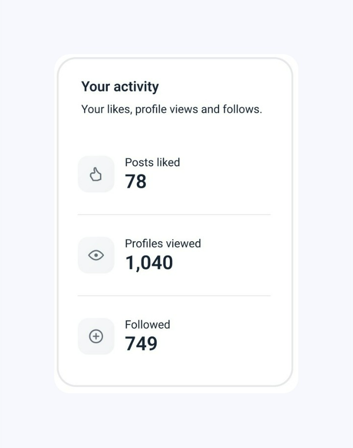
Other LinkedIn activity
While these actions don't directly affect campaign success, they provide additional touchpoints with your prospects and contribute to overall engagement.
- Posts liked: The total number of posts liked on prospects’ LinkedIn profiles.
- Followed: The total number of prospects’ profiles followed.
- Profiles viewed: The total number of prospects’ profiles viewed.

Campaign activity chart (LinkedIn)
This section of the report visualizes the volume of your LinkedIn campaign actions over time. The chart displays trend lines for the metrics you select, reflecting their volume over the chosen time period.
To adjust data in the chart:
1) Select a time period at the top. Based on the time frame you choose, the chart will be divided into sections (hours, days, weeks, or months), showing the volume of activities throughout that period.
A shorter time frame (hourly, daily) shows short-term trends. A longer period (weekly, monthly) shows broader patterns in your outreach.
2) Choose metrics from the options at the bottom. The chart will show them side by side, helping you compare their volumes.
The data points you select will be shown on the chart, indicating the time period in which they occurred and their volume (number of actions). Hover over the colored area to view details.
You can also export the data for each metric. Click View recipients to open and download the list of prospects associated with each data point.
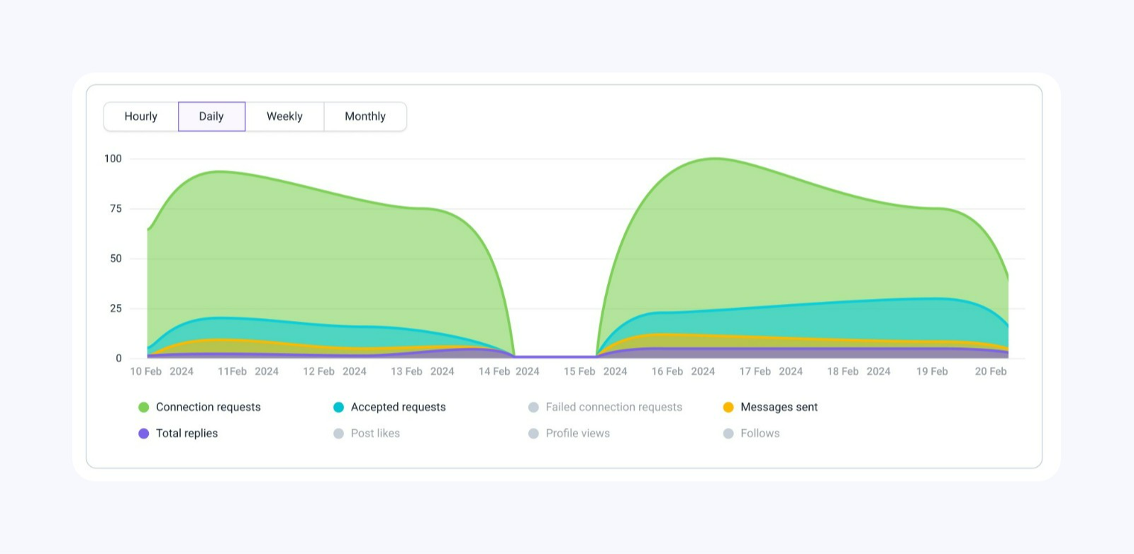

- Connection requests – A volume of sent connection requests for the selected time period.
- Accepted requests – A volume of connection requests that were accepted during the selected time period.
- Failed connection requests – A volume of unsuccessful connection requests for the selected time period.
- Messages sent – A volume of sent LinkedIn messages for the selected time period.
- Total replies – A volume of recipients who responded via LinkedIn during the selected time period.
- Post likes – A volume of post likes during the selected time period.
- Post views – A volume of profile views during the selected time period.
- Follows – A volume of profile follows during the selected time period.
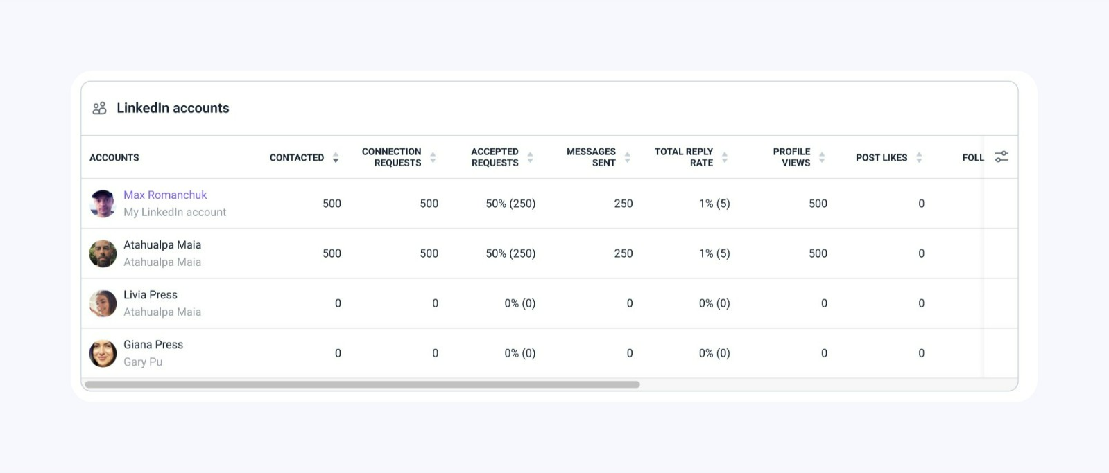
LinkedIn account statistics
This section of the report lets you monitor the performance of each LinkedIn account connected to Snov.io.
If you haven’t applied any account filters at the top, the list will display all LinkedIn accounts you've connected to Snov.io, including those not yet used in campaigns and those that were deleted after being used in a campaign.

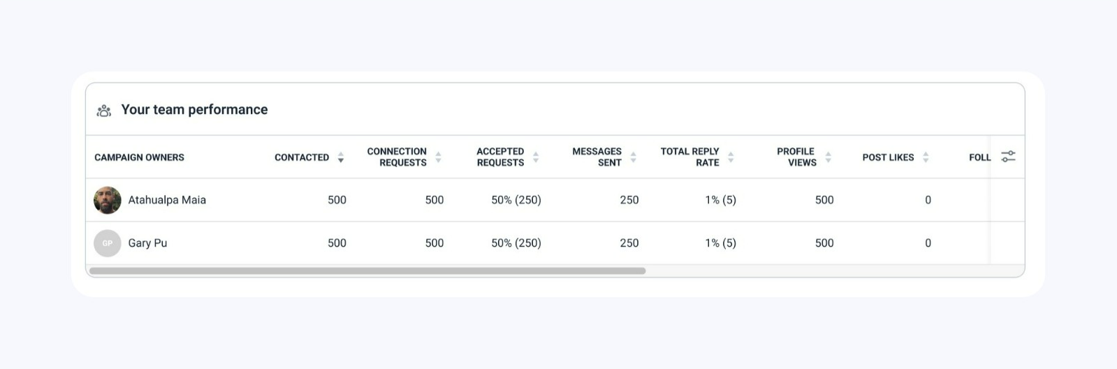
Team statistics (LinkedIn)
This section shows each team member's contribution to the overall results of LinkedIn Automation.
By default, the list displays all team members, including those who haven’t launched a campaign. To include specific team members in the report, use the Campaign Owners filter at the top.
Only team leaders and team members with the "View team records" permission can view statistics for other team members. Team members without this permission will only be able to view statistics for their own campaigns.

How we calculate General reports
The General tab in the reports dashboard combines data from email and LinkedIn reports. This allows you to monitor overall performance and compare statistics across the two channels to see which channel performs better.
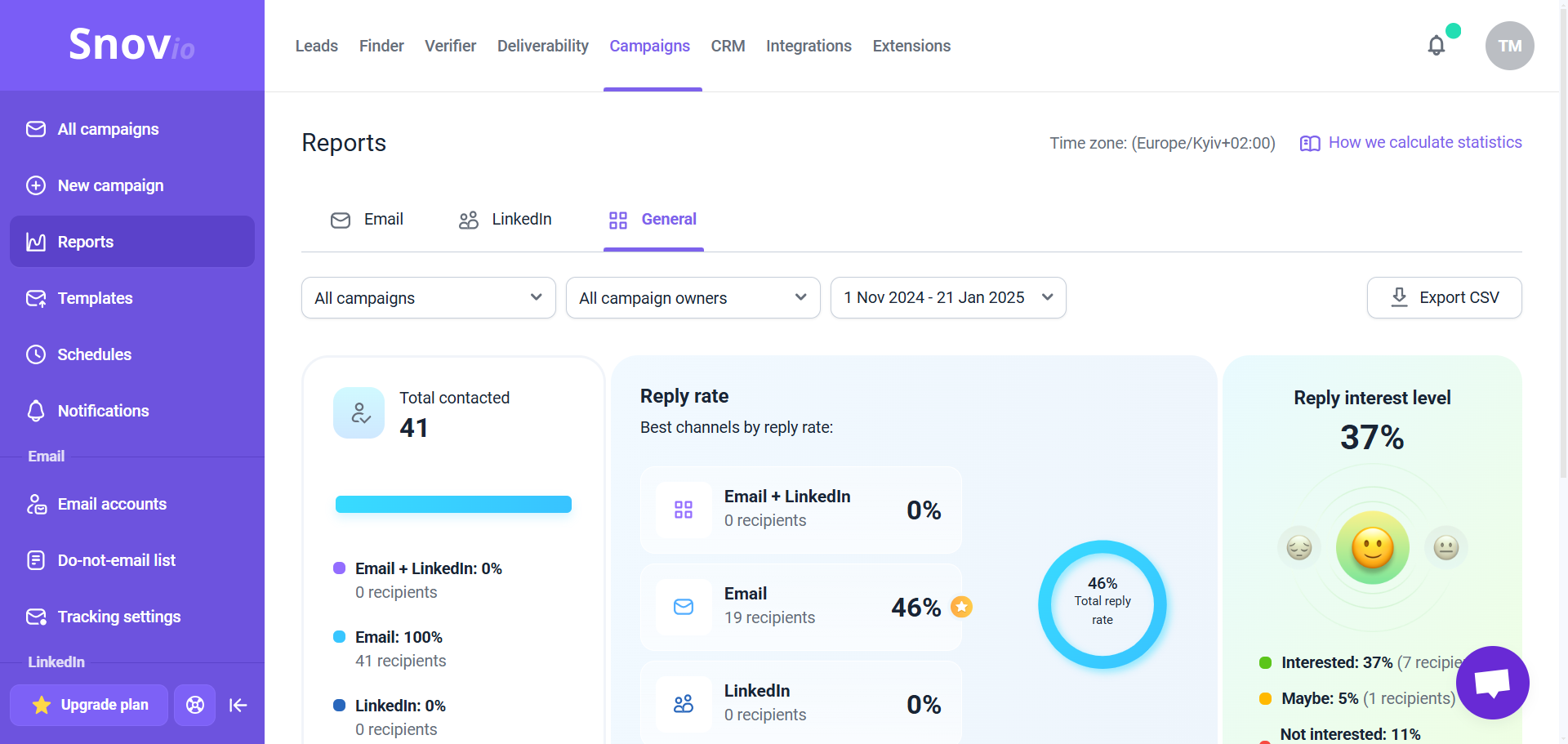

By default, it shows data from all campaigns and accounts over the last 30 days. You can use the filters at the top to view data for specific campaigns, accounts, team members, or a different time period.
The General report includes overall metrics from both channels and the comparison for each channel.
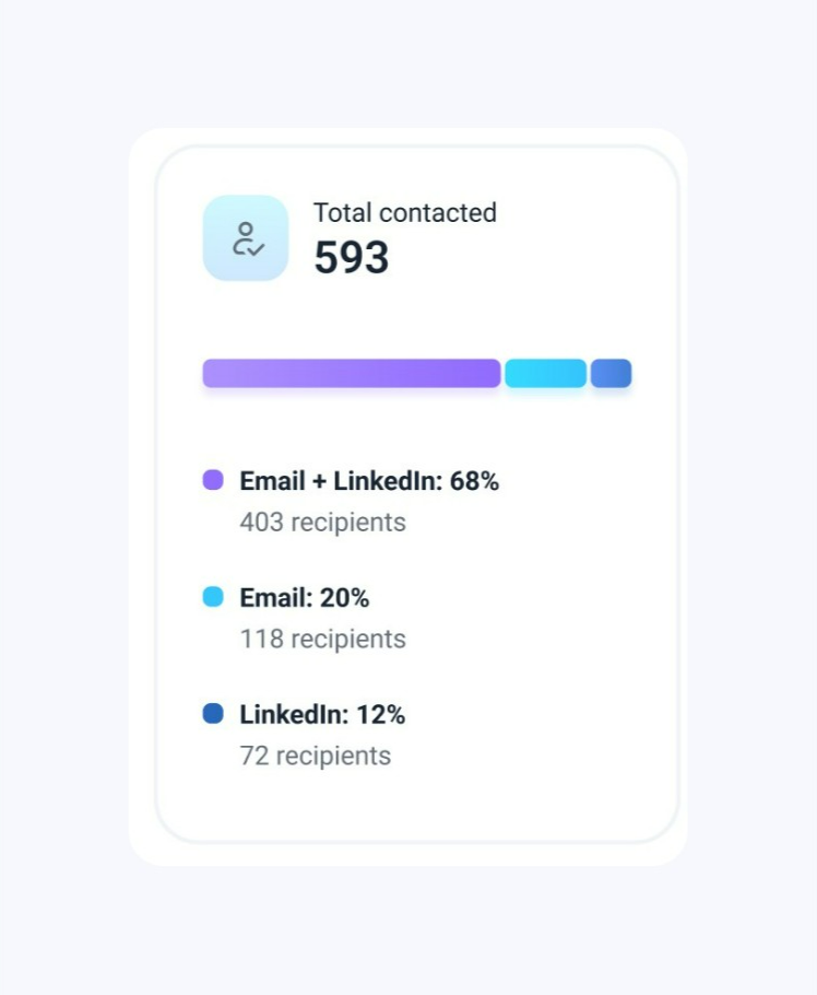
Total contacted
This metric shows the total number of recipients contacted by email or LinkedIn (connection request, message, or InMail).
The colored graph below breaks it down by channel: contacted by both channels, email only, and LinkedIn only.
- Email + LinkedIn: The percentage and the number of recipients contacted through both channels (email and LinkedIn).
- Email: The percentage and the number of recipients contacted only via email.
- LinkedIn: The percentage and the number of recipients contacted only via LinkedIn. This includes sending regular messages, connection requests, or InMail messages.

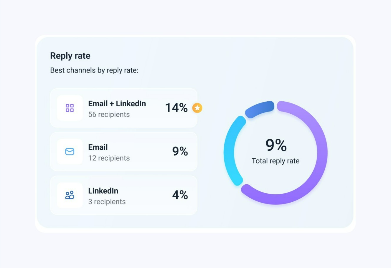
Total reply rate
This metric shows the overall percentage of recipients who replied after being contacted through any of the channels (in the selected campaigns and time period).
The colored graph breaks this down by channel: multichannel (both email and LinkedIn), email only, and LinkedIn only.
- Email + LinkedIn: The percentage and number of recipients who were contacted on both channels and replied.
- Email: The percentage and number of recipients who were contacted only via email and replied.
- LinkedIn: The percentage and number of recipients who were contacted only via LinkedIn and replied.

Reply interest level
This metric represents the overall interest level of your prospects across all selected campaigns. The percentage at the top indicates the portion of recipients marked as "Interested."
Since this is a general report for both channels, it takes into account replies to all types of messages: emails, LinkedIn messages, and InMail messages.
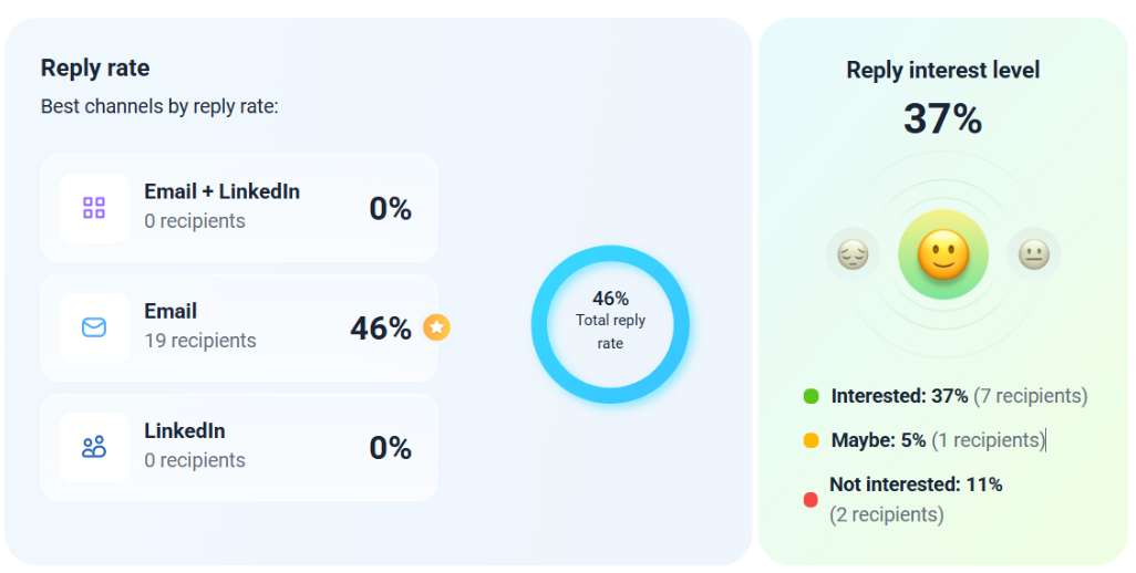

The Reply interest level includes statistics for all three sentiments: Interested, Maybe, and Not interested.
The percentages for each sentiment are calculated by dividing the number of recipients with that sentiment by the total number of recipients who replied. The overall rate includes all replies, even those without an assigned sentiment (not yet evaluated).
When calculating the interest level, we rely on the sentiment of the prospect's most recent evaluated reply (manually or automatically). If a prospect has an unevaluated reply, the interest level is based on the last reply that was evaluated.
If you are on a Pro 5K plan or higher, the sentiment analysis is done by AI automatically for all replies you receive. For lower plans, you need to manually assign the interest level to prospects' replies. This can be done in their profiles within your prospect lists. Read more about Sentiment analysis.
To export the Interest level, click on the recipient's number next to the required sentiment to open a list of recipients who match it. You can download the list as a CSV file. The general CSV export will also include a dedicated column for this data.
Your team performance
This section shows each team member's contribution to the overall results. It combines statistics from all campaigns they have launched.
By default, the list shows all team members, including those who haven't launched a campaign. To include specific team members in the report, use the Campaign owners filter at the top.
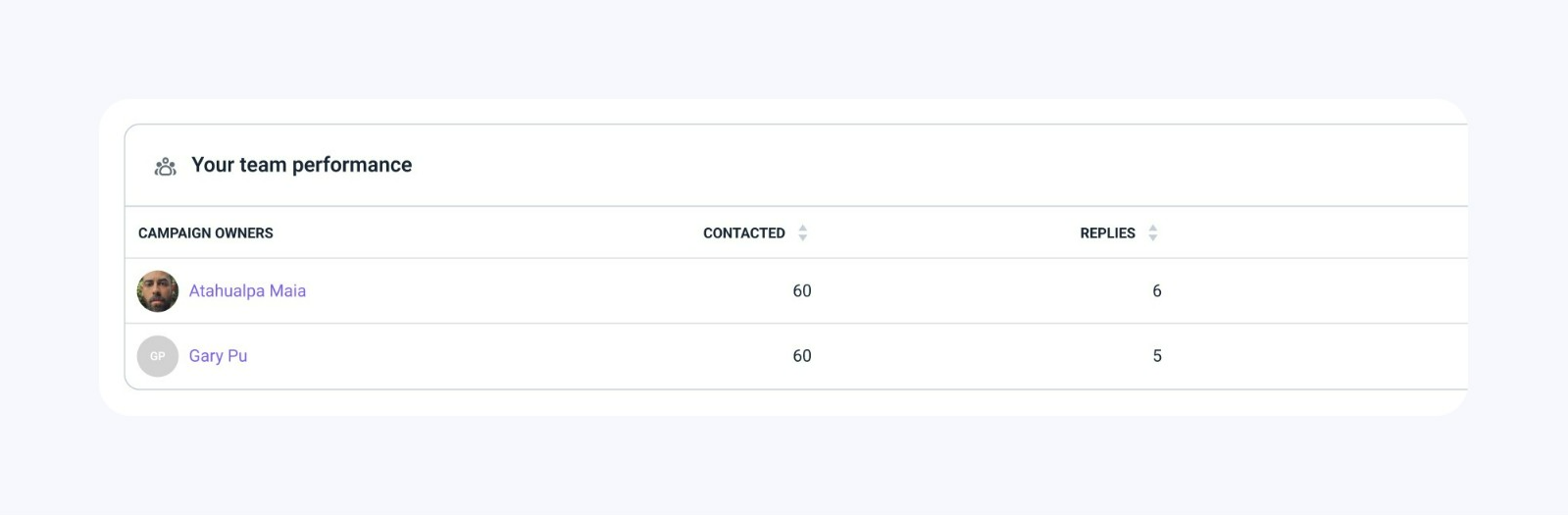

Only team leaders and team members with the "View team records" permission can see the statistics of other team members. Team members without permission will only be able to view the statistics for their own campaigns.
How to export reports to CSV
After reviewing the analytics, export data for recipients you've contacted using the export option.
To download a report, click Export CSV on the right. By default, the export will include data for all campaigns and recipients over the past 30 days. To get a custom export, adjust the filters at the top.
The export option is available in all report types:
- email: The default Email export includes data for recipients you’ve sent at least one email within the selected time period
- LinkedIn: The LinkedIn export includes data for recipients to whom you’ve sent a connection request, message, or InMail within the selected time period
- General: The General export includes data for recipients you've contacted via email or LinkedIn (a connection request, message, or InMail)
The Export CSV option has a limit of 200,000 rows per file, which means the maximum number of recipients one export can include. If your data exceeds this limit, use filters to break down the export into smaller parts.
You can get a full activity report per channel for all recipients or a segmented list based on filters and KPIs.