A strong brand identity is the foundation of any successful company. It sets you apart from the competition and ensures your product continuously resonates with customers. However, creating a unique brand identity is often not easy for small businesses as they don’t have enough funds, tools, and digital marketing experts to beat big brands.
Does it mean branding is not for small businesses? Well, no. Branding is for everyone — regardless of business size. You just need to have the right marketing and SEO strategies in place.
In this blog post, we’ve prepared a list of small business branding examples so you can see how these strategies work in practice. But let’s first clarify the term ‘branding.’
What is branding?
Branding is a social selling technique that helps establish a strong connection between brands and audiences, leading to faster lead generation and growing customer loyalty. Notably, 70% of consumers prefer buying from a brand they know.
Whether you offer accounting software to B2B users or have an online retail store, establishing a unique brand is super crucial for all. But why do some companies succeed in branding while others don’t?
According to Pam Moore, one of the most prominent branding specialists, it takes about 5-7 impressions to make users aware of your brand. So, you need to constantly work on promoting your products and services to create a positive connection with your brand, which will help you grow your business.
And when I say ‘constantly work,’ I don’t just mean days and hours. Branding is often about creativity.
After all, it’s creativity that can improve conversion rates for SaaS companies, eCommerce companies, and everything in between.
Here are 12 small business branding examples that will prove that you can build your brand even on a budget if you add some creative approach to the process.
12 creative examples of small business branding
1. Snov.io
Snov.io is a lead generation and multichannel outreach automation platform. In the market with so many SaaS companies that offer similar functionality, what makes Snov.io website visitors remember the brand?
First of all, it’s a color palette. While many businesses refrain from using purple and prefer calmer colors for branding design, Snov.io combines the stability of blue with the growth energy of red in one, so the main elements (logo, CTA buttons, headers) look especially attractive.
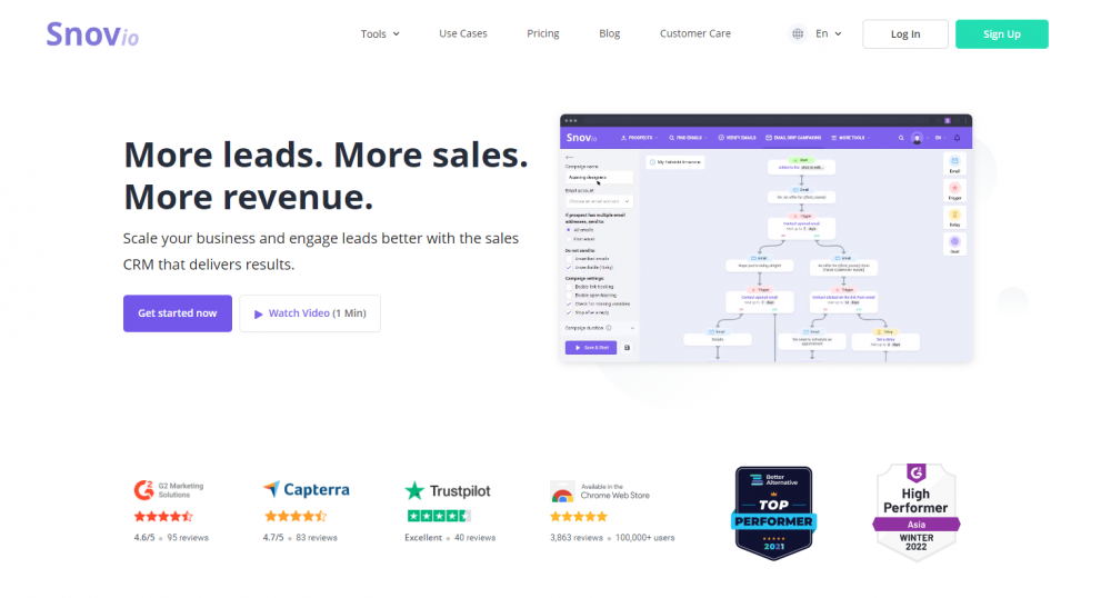
The landing pages add to the effect. Factual information, animated screenshots of how the functionality works, testimonials – everything points to the company’s credibility.
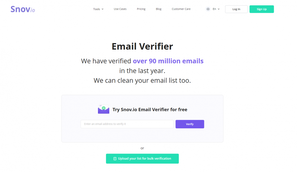
But what makes prospective customers come back is the possibility of trying the service in real-time – you can try how Snov.io Email Verifier and Email Finder tools work without leaving the website.
Key takeaways:
- Don’t be afraid of non-standard solutions. If your brand vision presupposes bright yellow or dark black design, why not try these colors?
- Bring value at once. Showcase your competitive advantage right on your website, letting visitors try your product. They’ll know you as the brand that does, not tells.
2. Marveta
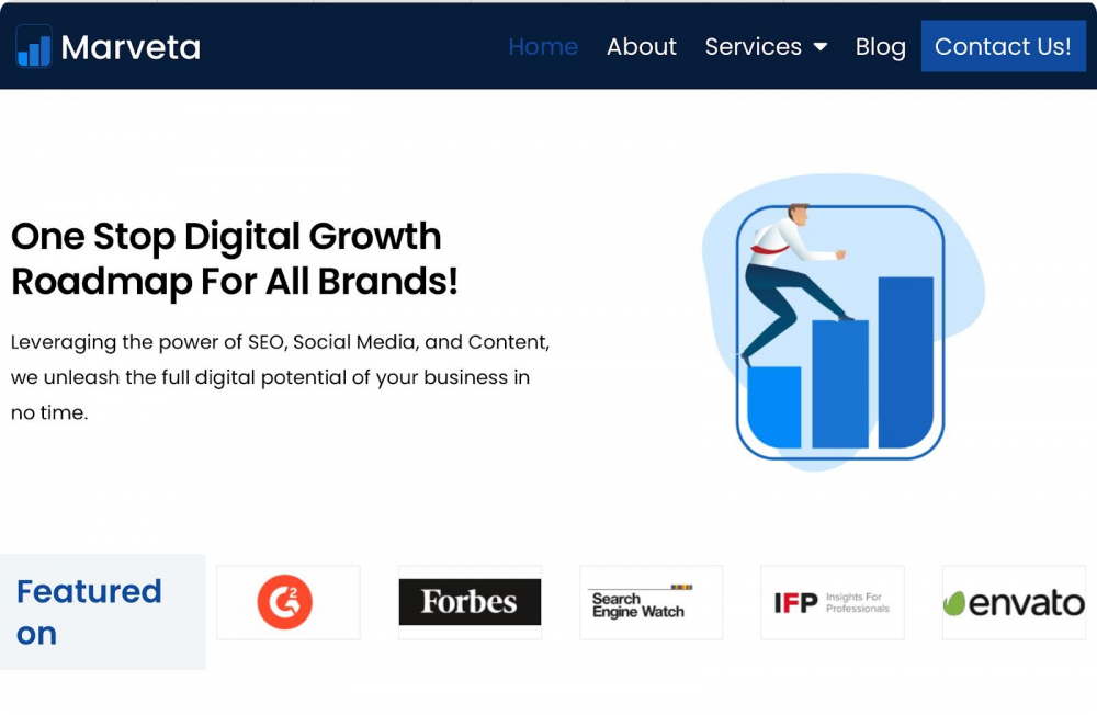
Marveta is a digital marketing company that helps other brands grow online. You can definitely expect its branding message to be powerful and innovative. But despite the rigid language targeted at highly professional users, the brand has opted for a friendlier approach.
Marveta’s content tone is engaging and relatable, while the brand logo is a perfect way to describe growth in a minimalist manner. As for the color, they used vibrant blue shades to make their website look approachable yet in style.
And when it comes to social proof, Marveta knows what to do: they feature their partners, so visitors can see the company is worth doing business with.
Key takeaways:
- Be informal for the formal. Marveta branding shows that a bit of buddiness is often a good way to establish a connection with even very serious customers.
- Feature top partners. Mention your partners or customers on your website. This helps provide much-needed social proof and build an authority for the brand.
3. UnboundB2B
UnboundB2B is a leading B2B lead generation service company. The brand provides a series of lead generation solutions to businesses, such as account-based marketing, email marketing, and more.
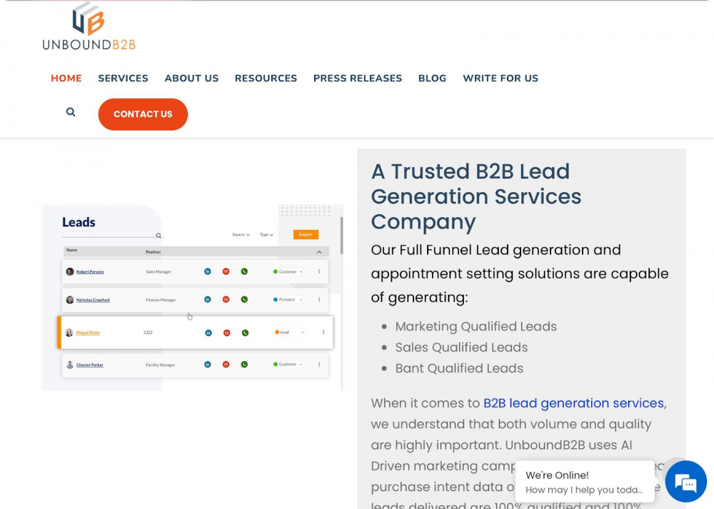
This company is directly targeting the B2B market. Therefore, they have used a simple and clean website layout to attract professional users.
In addition, bright orange and mellow black colors have helped create a professional yet approachable brand identity, while the unique logo and beautiful use of whitespace help accentuate the brand appearance.
Key takeaways:
- Use razor-sharp content for professional users. If your audience is business professionals who don’t have much time, leave all the fluff and power words behind to create direct and informative content for them.
- Apply all your creativity to the logo. If you don’t have much room to play with creativity, like UnboundB2B, show your creative approach while inventing an innovative logo.
4. Cuebiq
Cuebiq is a location intelligence and measurement company that uses data to create an offline customer journey graph for businesses. Their operations might sound confusing, but they mitigate it with a simple branding approach.
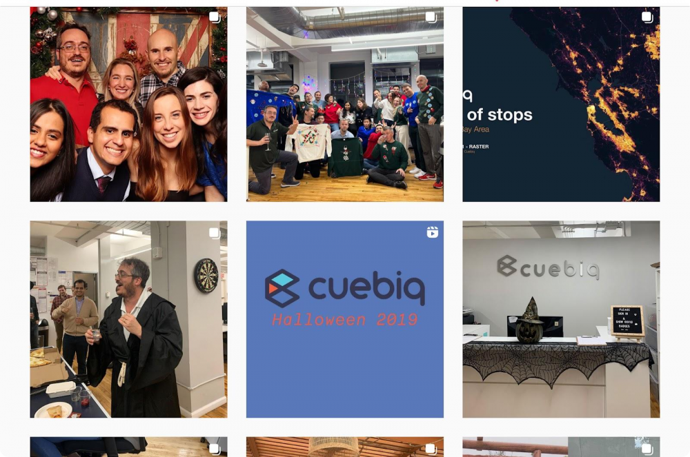
Cuebiq prefers to adopt a human-centric brand voice to take the technical edge off. They have placed a dedicated team section on their website to show prospective customers that they will interact with humans, not bots. Meanwhile, their Instagram page abounds in employees’ pictures and company event stories, which helps demonstrate the positive brand culture.
The Cuebiq’s logo highlights the company’s name, while their relaxing blue color tone helps present the company as the one you can indeed rely on.
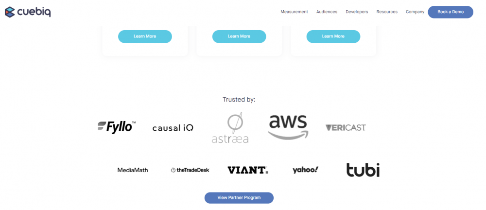
Like Marveta, Cuebiq’s website includes the section that lists the company’s partners and customers, but they’ve gone further and animated it, which looks brisk and attracts attention.
Key takeaways:
- Talk about your people. Cuebiq has taught a serious branding lesson to B2B small businesses. It shows how talking about your people and company culture can build your employer’s brand and connect you with potential clients.
- Animate. Think that words or pics all look the same boring? You can always add a bit of animation to stand out.
Now that we’ve provided some SaaS B2B examples, let’s look at B2C inspiring branding examples.
5. Death Wish Coffee
Death Wish Coffee started its way into the market that had already been monopolized by big brands like Lavazza and Nescafé. Since the company doesn’t sell anything unique, it was challenging for them to build a unique brand identity.
But they used a creative approach and made their marketing more brutal than other coffee brands. If you head to the Death Wish Coffee website, you might feel its badass vibe. Unlike other coffee brands that focus on family tone, these guys use strong vocabulary to excite hardcore coffee drinkers.
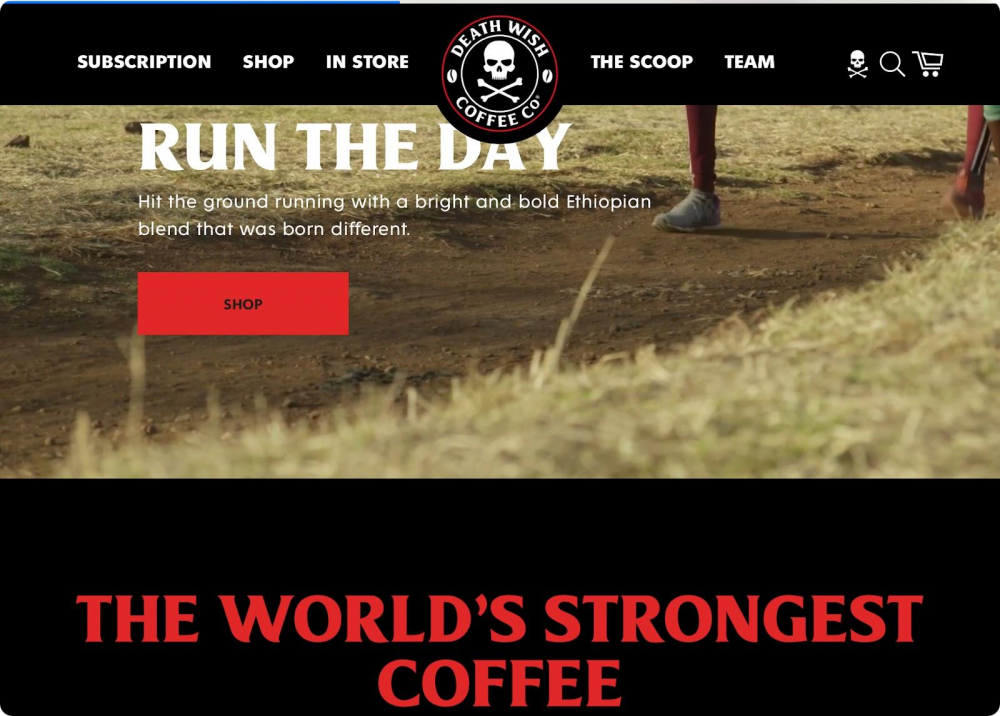
In addition, Death Wish Coffee is obviously aware that color can improve brand recognition by 80% and has used this concept very well. Bold black, white and red color combinations helped the company build a strong coffee brand image.
Finally, the company fully understands its audience, so they use account-based marketing techniques to target a specific group of coffee drinkers and create audience-centric content.
Key takeaways:
- Target specific audience. The coffee market is extensive and highly competitive. But how many brands sell the strongest coffee? Not many. So, instead of targeting the whole industry, you can target a specific area to establish your authority.
- Highlight your identity. Death Wish Coffee targets bold people, so they use the corresponding name, logo, message, and color palette.
- Keep it simple. Death Wish Coffee has a simple website with limited content on it. Using just a few words and a clear brand message, you can easily promote your brand online.
6. Ricola сough drops
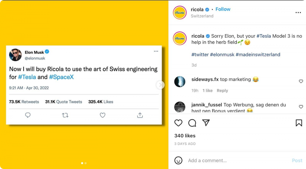
Ricola is a popular Swiss herbal medicine to treat a cough. And while it seems nothing is interesting about the product, it has caught Elon Musk’s attention enough for him to tweet about the brand.
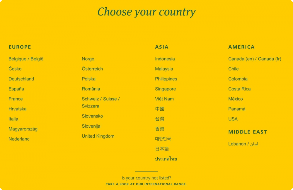
The company uses a global marketing approach with precise segmentation and personalization. If you open the Ricola website, it will ask you to select your region, and accordingly, you will get a personalized website in your own language, which helps build connections with local users.
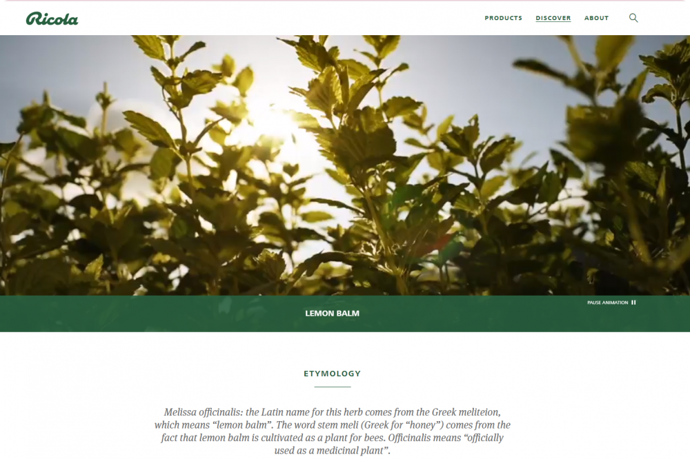
In addition, knowing that people are 22% more likely to remember facts if they are a part of a story, the Ricola website tells your stories about their herbal medicine and how they use herbs grown in a natural environment to make cough drops – all against the background of picturesque animated landscapes. That’s how they professionally combine two tactics – storytelling and animation.
Key takeaways:
- Make your branding personalized. Provide personalized content or visual elements to your audience for better relationship building.
- Use storytelling. Tell prospective customers stories connected with your brand, and they will surely remember it.
7. Uzuri K&Y
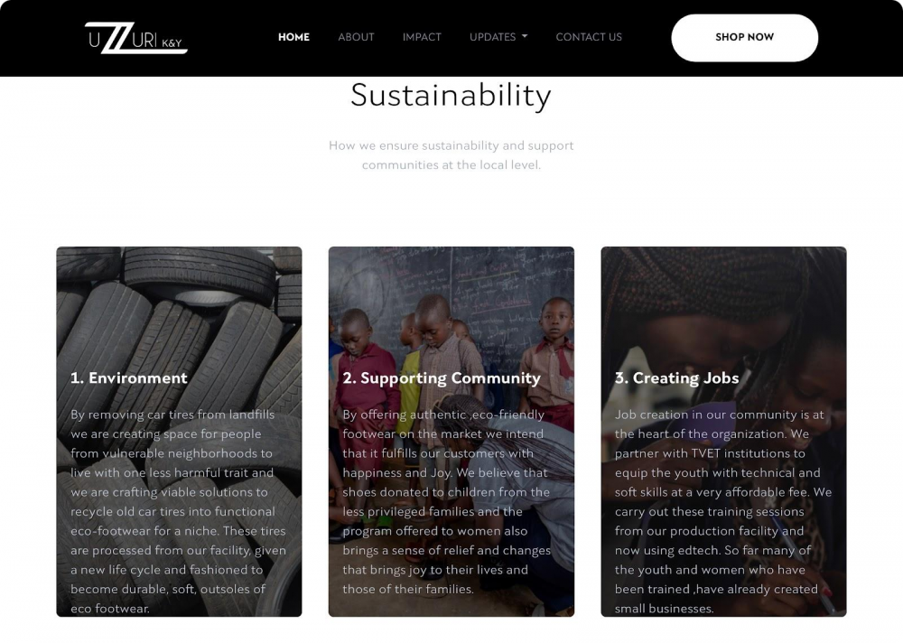
About 13% of consumers are willing to pay 31-50% more when they are under the impression that your product or service positively impacts the world. Uzuri K&Y, an African-inspired shoe manufacturer, is just the brand to target this market segment.
The company stands out from the crowd owing to the focus on global issues raised in their main message, such as environment protection, youth education, and feminism, rather than selling shoes.
This helps establish an emotional connection with customers. So, as soon as you approach the stage of looking through the product list, you feel the need to buy it, as this way, you’ll participate in something that improves the lives of others.
Key takeaways:
- Appeal to emotions. Your buyer’s psychology is a susceptible thing. Emotional pics, stories, or just a message on your website – you have many options to make your brand resonate – so do use them.
- Be global. As a rule, global issues are more associated with big companies. Why not try to speak their language? Global awareness can bring you brand awareness.
8. SmileLABS
Not many people are fans of dental clinics, and it’s hard to be unique when selling dental products.
But SmileLABS have shown that you can also stand out in this business. Instead of popular teeth pics you can find on practically any website of similar clinics, the company offered a totally different approach – they’ve placed large-scale videos of their customers with bright happy smiles and perfectly white teeth.

Thanks to the clear brand logo and name, users will immediately get an idea about SmileLABS and what they offer.
Key takeaways:
- Don’t chase a sophisticated design. When you don’t have a special product, simplicity is the perfect sales plan to sell it.
- Use attractive videos. Use videos as solid proof of how your product brings value.
9. Surly Brewing Co.
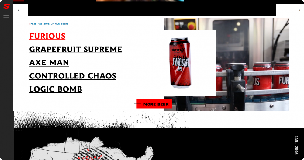
Surly Brewing Co. is a leading beer manufacturing company in Minnesota. The brand voice is bold and communal, yet the company is very creative when it comes to its product descriptions.
On the Surly website, you’ll find a dedicated section called Gives a Damn. This page talks about all that Surly’s team does to give back to society.
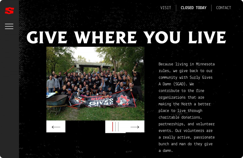
In addition, the brand has made an effort to create a transparent customer environment. You’ll get a big popup about the company’s beer-producing process when you open their website.
Key takeaways:
- Make creative product descriptions. People might forget your pilsner or lager, but they’ll most likely remember your ‘ax man.’
- Use social triggers. Surly Brewing has built an emotional connection with its users by showcasing their volunteer work details. If you have anything to share, why not do it?
10. Imperfect Foods
Imperfect Foods is a food brand founded in 2015 with a unique mission to eliminate food waste and make ugly-looking (in fact, healthy) food better for everyone.
They use creative ideas to justify brand messages they promote on social media platforms.

The website has elements of fun combined with real photos of products, making the goods appealing and brand memorable.
Key takeaways:
- Look for the silver lining. You don’t have to design a new product category to build a unique brand identity. You can simply look for flaws in your industry and turn it around like Imperfect Foods.
- Leverage social media. Social media plays a significant role in modern branding strategies. Imperfect Foods uses Instagram to build a creative food brand.
- Use elements of fun. Cartoon images are not just for kids. Experiment with funny pics if your product and mission statement allow.
11. Zonzo
Zonzo is an Australian winery where you can taste exquisite wine and organize your dream wedding. The brand has opted for a whimsical and dreamy vibe to attract wine lovers and people who want to tie the knot in surreal surroundings.
The very name of the brand is memorable owing to the repetition of similar sounds. The brand logo, website content, and color palette are minimal and human-centric. Zonzo uses stunning photos and videos to present its winery to visitors. All the visual elements on the website tempt users to visit this place.

Like Ricola, Zonzo prefers to tell their unique story. And they pepper it all with the rustic charm – just look at the font. Doesn’t it remind you of an old typing machine standing on a wooden desk somewhere in the provincial area?
Key takeaways:
- Learn your customers. Zonzo understood that wine production is a rustic process, but weddings are an elegant and sophisticated affair. Therefore, they used a rustic font and sleek color palette to connect with their customers.
- Use a memorable font. Fonts matter more than you think. So if any of them conveys your message better than others, do use it.
12. Adelante Shoe Co.
Adelante is a handcrafted men’s and women’s shoe company from Guatemala that found its niche – they produce hand-made shoes and target consumers with any foot size.
What makes this brand stand out is the human-centric approach. On their website, you’ll see the photo of one of Adelante artisans, Selvin, welcoming you to the store, which proves their product is made BY people and FOR people.

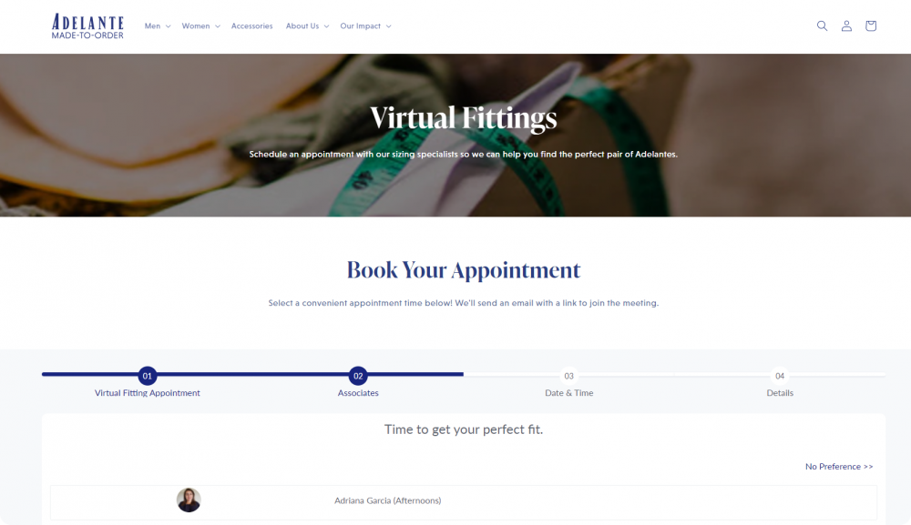
What you’ll also never forget about this brand is how they organize personalized cooperation with prospective customers. You may book personal virtual appointments with Adelante sizing specialists so they can help you find the perfect pair of shoes.
Key takeaways:
- Be customer-centric. Ensure your brand speaks directly to every customer. Share how you helped real people or showcase real people from your team to reach people’s hearts.
- Offer special value. Give people an option to hold appointments with prospects where your customer service team will help them before they even decide to try your product. This will help you build strong clienteling and attract more customers.
Conclusion
Branding means how others will see your products and services. Thus, you should create a brand identity keeping your target audience in mind. And it doesn’t really matter whether you have a small or big business; having clear brand value can help you a lot.
As you have seen from the examples above, simplicity and clear brand message have helped most businesses to communicate with their customers, while each of the companies added special techniques to make their brand stand out – animation, video content, storytelling, social proof, etc.
Now, get your creative juices flowing and start building your unique brand. Meanwhile, Snov.io will take care of your sales and marketing processes.


