Call to action (CTA)
On the web, you most certainly have seen many shiny buttons and requests to take some action. For example, when registering on websites like LinkedIn or Facebook, you might have encountered a call to action that urged you to like, click, read, sign up, or log in.
What is a call to action?
In marketing, a call to action (CTA) is any statement intended to stimulate an instant reaction. It usually uses imperative verbs such as “find out more,” “call us now,” or “visit the store today.”
The most apparent call to action examples are the ones that urge the user to buy a product or to give contact information. But it can also be a non-pushy suggestion like “choose a color,” “watch this video,” or a more specific request.
CTAs aren’t just used in digital marketing: brochures, catalogs, and flyers also take advantage of calls to action. Such commands are designed to show customers what next step they have to make and to create a sense of urgency around the offer.
To push the idea of urgency, a CTA can be related to a special promotion with a time restriction: “Purchase before 00.00 to get a personal gift with your order”, “Three for the price of two for the first 100 visitors”, etc. A call to action aimed to persuade users to instantly buy the product or service can be backed by an additional motivator “Your offer expires soon” or “Limited number available.”
How does a call to action work?
We know the basic principle. However, few understand exactly how the psychology behind a compelling CTA works. What makes it successful? Why do users click on it at all? How important is the wording?
There is a simple reason hardly anyone can put this into words in short – the effectiveness of a CTA is not limited to a simple button, banner, or picture. The entire context of a website and the storytelling around a CTA help close the deal.
One thing is certain – the success of a CTA is not conjured up by the magical combination of a few words. Website visitors will only click on the CTA button if the following three elements are used correctly:
- What your visitors already know about your brand (past)
- What impression visitors have when browsing your website (present)
- What your visitors expect by clicking the button (future)
How to write a call to action?
As explained in the beginning, a CTA is much more than just a simple button. It should be seen as part of a larger overall impression. This impression is made up of a strong start, a successful company presentation, a strong presentation of your product, and a final recommendation or appeal.
In fact, the success of your CTA is directly related to the strength of your sales funnel. So ask yourself: Where do my users come from? How can I interact with them? What steps are necessary so that they ultimately follow my CTA?
If you already know the answers to these questions, there are some smaller tips that can help you increase your CTA’s conversion rate:
Visual appeal
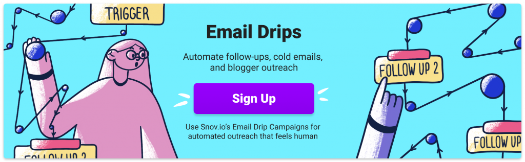
An appealing picture is essential. Use images that correspond to the image of your brand or the mood of your company. Avoid images that are too sales-heavy. A video format is also an option.

Wording
Keep it short, clean, and convincing – less than five words is ideal. Always adapt your wording to the target group. Digital natives, for example, want to be addressed differently than other age groups.
Emotional triggers
Use emotional trigger words to ignite curiosity and boost the click-through-rate.
Verb choice
Use specific action verbs that create a sense of urgency. Point out a time limit and increase the pressure to act.
Placement
Put your CTA where it makes the most sense in context. It is not always advisable to include it at the top of a page. The user must first have the opportunity to get to know or understand your product. Ask yourself: When would I personally be ready to take action for the first time?
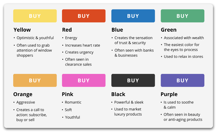
Colors
To make your CTA stand out, use a different color than the rest of the page. In terms of design, it shouldn’t be in conflict. Here you have to find the golden mean – collect feedback on this from test users. Alternatively, there is a lot of inspiration on the Internet for color combinations and color palettes.
Size
Your CTA should be easy to spot. But remember: more is not necessarily better. Your CTA shouldn’t make browsing on your site cumbersome or distract customers from important information.
Clarity
Your promise of performance should be clearly communicated. Clarify the advantages that a click on the CTA has for your users.
How to test the productivity of a call to action?
A good way to test the productivity of a CTA is by performing an A/B test. For example, several different banners or messages can be displayed to users, and the message with the highest success rate will be selected as the default one. Remember to always A/B test one thing at a time for accurate results.
Digital marketing can use analytical feedback to improve both the style and number of CTAs. Print media and other conventional means of marketing, on the other hand, suffer from a shortage of feedback instruments that can provide an immediate response.
But in all cases, regardless of whether you use digital or traditional media, it is hard to convert the public into clients if your ads lack a distinct and clever CTA.


