
In an email campaign, every single detail affects email’s performance. And nothing has a bigger impact on the subconscious of a lead than color combinations. With each color holding a specific strong message, every marketer needs to be proficient in the psychology of colors to present their product better and convert leads easier.
So exactly how many colors should you use in an email? How do you match colors? Should you make the CTA button green or red? We’ll answer these (and even more!) questions in this complete guide to colors in email marketing. Read on and you’ll be using marketig colors in email marketing like a pro in no time.
Outline:
Color psychology in email marketing
Color is often the untapped leverage that decides whether an email campaign succeeds or fails. The colors’ psychological effect on people has already been studied for decades, and still, new things are discovered every year.
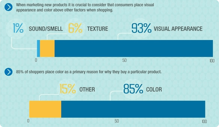
However, in the context of marketing colors, data is ever-changing. For example, 93% of consumers place color in the first place when making a purchase, with 85% naming it the primary reason for buying a product.
At the same time, corporate colors create certain boundaries on which colors one can use in their email campaign. Therefore it’s best to keep your options open to target specific clients with specific colors.
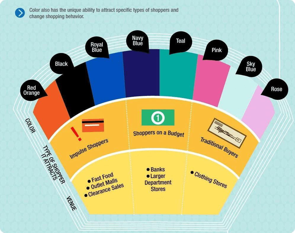
According to the aforementioned study, some colors are used for a definite type of buyer: red, orange, black, and royal blue for impulse shoppers; navy blue and teal for shoppers on a budget; pink, rose, and sky blue for traditional buyers.
Choosing the right color combination
To use the right colors in your emails, you must know what each of them means, and which ones are better to combine. Then your emails, using marketing colors, will turn into a powerful tool for increasing lead generation.
Furthermore, incorporating an image color editor into your email marketing strategy can significantly enhance the visual appeal of your campaigns, allowing for more precise color matching and branding consistency.
White
Purity and independence
Unlike black, white pretty much always has a positive meaning and is associated with purity, cleanliness, and innocence. For many people, it is associated with new beginnings as it is a symbol of starting from a blank slate. If the color is used correctly, you can easily create a feeling of simplicity and safety.
However, overuse can imbue a sense of emptiness, coldness, unimaginativeness, boredom, and incompleteness. Which is why plaintext emails, while effective, are often labeled boring and unimaginative.
Tip: A white background can be combined with any color, so a bright spot of text will always grab the customers’ attention. White is not the best idea for the text itself: in a white or light grey background, it blends and looks like spam to ESP, and reading it is difficult and tiring for the eyes.
Black
Authority and elegance

Black symbolizes power, authority, luxury, and elegance, which is why the color is often associated with prestigious items, such as cars. But if there’s too much of it, it may evoke a sense of the unknown and translate negative meanings. So use it sparingly so as not to overwhelm the recipient. Use it to accentuate the elegance, prestigiousness, or power of your product.
Tip: This color, just like white, is cross-functional and looks clear with contrast colors. However, don’t use a black background – it makes the contrast-color text in the deep field unreadable.
Red
CTA and urgency
Opinions on the connotations of red are split. Its positive connotations are energy, power, and determination, the negative – blood, danger, and aggression. That’s why red is widely used for road signs and (nearly) always used for the Buy now or Click here buttons. This bright color has great visibility and is perfect for creating accents in plain texts and backgrounds to stimulate people to make quick decisions.
According to a Hubspot A/B test, red increases conversions by 21%. However, it should only be used to highlight text in the general email color scheme. If all your email text is in red, it won’t help your CTA. Don’t forget to A/B test your colors too.
Tip: Use red to make your CTA stand out among other colors in your email color scheme. Red works best when combined with the most basic colors like white and shades of gray.
Blue
Security and reliability

Blue provides a calming effect. It mostly expresses a sense of serenity, security, reliability, confidence, and stability. Depending on your business, however, using blue can backfire. For example, blue isn’t used in the food industry, because it curbs appetite. But it is a great solution for high-tech products and anything associated with intellect.
Besides that, blue has been proven to be the most popular color among both women and men. So, don’t hesitate to use it in your email – everyone will be happy to see it.
Tip: Use blue if you want to calm your customers and persuade them you’re trustworthy and dependable. But use it sparingly – an overabundance of blue can evoke a sense of coldness and unfriendliness.
Green
Tranquility and peace
Like many colors in email marketing, green, alongside blue and white, expresses tranquility and calmness. It also conveys relaxation and protection, freshness and improvement. As a rule, this color is used to promote health-related and so-called “green” products.
Green, being the color of nature, has a soothing effect, creates positive associations, and even affects depression. In a slightly less environmental meaning, green is the color of money, so it is often used to express financial wealth and growth.
Tip: Be mindful of color gradation as a minimal variation in color shade or tint can create a completely new meaning. For example, yellowish green is associated with sickness and confusion; dark green indicates greed and frustration. If you are eager to make your clients and prospects wake up, relax and make a decision, use green in your email marketing planning.
Yellow & orange
Happiness and savings

I’ve decided to present these colors together because they are similarly sunny, both create a positive mood and can be used for the same purposes. They provide a sense of warmth and cheerfulness, creativity and enthusiasm, fascination and energy. Those colors are bright and work well on dark backgrounds, which is why many road signs are designed in these colors. They will concentrate your readers’ attention on the most important things in your message.
But be careful with their shades: they can induce feelings of deceit and sickness. Besides, sometimes yellow is considered a childish and unstable color, so be careful when using this color to advertise luxurious products.
Tip: Use both bright yellow and orange colors as they are believed to be attention-grabbing and represent affordability, attracting impulsive buyers.
Purple
Luxury and creativity
Purple is an artificial color. It has been used for kings’ robes to underline their superiority, which is why it usually stands for luxury and royalty, beauty and wealth. Another connotation is creativity. If your brand is a creative one, you should definitely try using this as your corporate color. If you make purple your brand color, all your emails will become easily identifiable.
To emphasize the superiority and the prestige of your brand, combine purple with yellow or golden brown – this has traditionally been the color combination of the royalty.
Tip: Use purple to soothe and calm your readers, and to provide the illusion of royal service. Avoid using dark purple as it evokes frustration, nostalgic feelings, and sadness.
Colors and color combinations to try in your email
Pantone Colors of the Year
Use Pantone Colors of the Year for inspiration. Every year Pantone, aka The Global Authority On Color, spends months to choose a Color of the Year. These are usually the colors that express what’s happening in the global culture and the general mood of that year.
These are vibrant, eye-catching, interesting, and, most importantly, recognizable colors you can easily use in your email campaign. 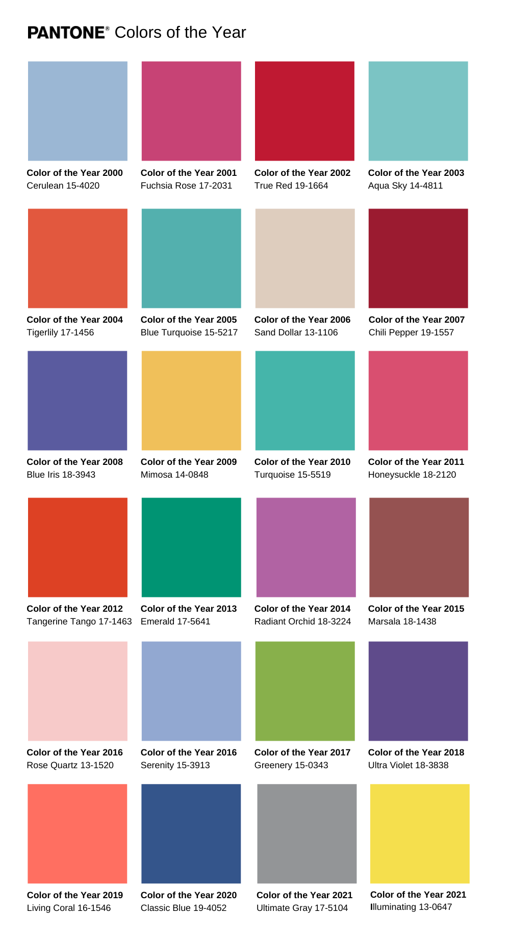
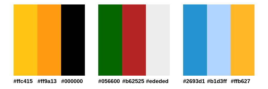
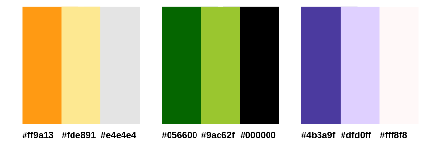
In 2021, the colors of the year were 17-5104 Ultimate Gray and 13-0647 Illuminating (Yellow). The color combination is described as “the union of strength and positivity. It is a story of color that encapsulates deeper feelings of thoughtfulness with the promise of something sunny and friendly.” As we all can make conclusions after 2020, this combination does have a deep meaning.
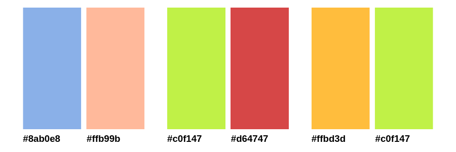
Pretty Colors Tumblr
There’s a pretty popular Tumblr blog that posts pretty colors submitted by the blog’s own followers. You can look through their archive for some inspiration. Here are some of our favorites.
Color combinations
Your goal is to make the email readable, easy on the eyes, and beautiful enough to remember. Remember to always add a couple of complementary neutral colors. Your color theme should have 1 or 2 bright colors maximum, and 1-3 colors to complement it.
There are a couple of ways to combine colors, but here are the most popular.
Combine opposite colors
Despite what you might think, combining opposite colors can produce nice results.
Try combining dark colors (black) with bright ones (orange/yellow) and directly opposite colors (red/green, blue/yellow). Make sure to keep them at more or less the same level of brightness and saturation – for example, combining muted green with bright red might come across as a mistake more than a design desition. The same goes for combining light pastels and “dirtier” colors.
Established color combinations
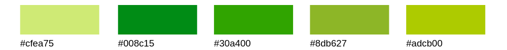
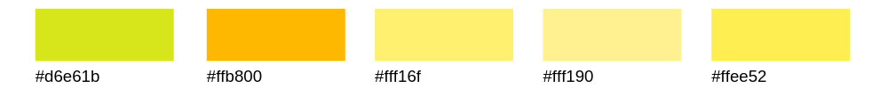
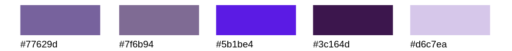
Combine naturally occurring combinations (watermelon, melon), and established combinations (pastel blue and pink). These color combinations are easier on the eye because they already exist in real life.
These go especially well with anything concerning the food industry, for example, recipe newsletters.
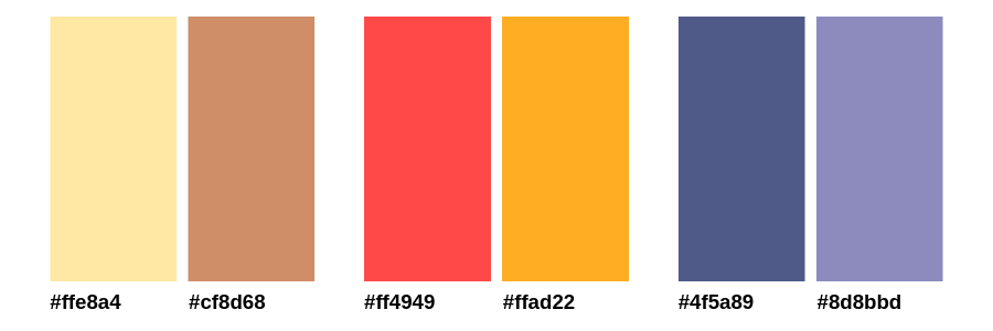
For example, check out the combinations above: the first one is perfect for baking-themed newsletters, the second one will clearly read grapefruit, and the last one – blueberry. Don’t hesitate to copy Mother Nature.
Combine shades of the same color
Combine lighter and darker shades of the same colors to create easy gradients that are both complex and easy to look at. You can add a third color for contrast or as a neutral accent.
Use moodboards
Another easy and creative method of combining colors together is moodboards/colorboards. Brought from the fashion world and interior design, it’s an ideal way to play with color schemes, and to get an idea of how shades will work together.
The easiest way to collect a perfectly matching shades palette for your design is to search on Pinterest, Google, or Instagram. Pictures of nature are the sure-fire way to select a harmonic fusion that will perfectly match in your email design, because nature is harmony itself.
How to create beautifully designed emails with Snov.io
First of all, use this link to claim your forever-free access to Snov.io toolbox. You will get access not only to email drip campaign builder, but also to the lead generation instruments that will help you find, study, segment your audience, and help them go down the sales funnel to reach your marketing goals.
Now, open email drip campaign builder. To create beautifully designed emails, you can insert your HTML-templates right in the Email element. And if you want to learn more about building great email campaigns, check our guide on how to create an email drip campaign.
Keep it simple
All in all, if you want to make your email attractive, follow these simple guidelines:
- Make your email readable: three colors are enough.
- If you don’t want to choose a color for every new campaign, choose and use the company’s corporate colors. This will also make your emails recognizable.
- Check if your email is easy-to-read: some colors just don’t work well together.
- Use one main contrast color for CTA to make it stand out.
- Use specific colors for specific purposes: bright energetic colors to evoke a response, neutral and dark colors to relax.
- If you are bad at color combinations, use naturally occurring color combinations instead.
And remember, everything depends on your customers’ preferences, which is why you should test every font and color you choose on the audience you’re sending to to achieve the best results. It’s been proven that most men prefer bright colors, achromatic colors, and shades, while most women are more responsive to soft colors and tints. In short, always segment.
Related: How To Write A Professional Email: Emojis, Pictures, Links, And Fonts
Want to know what happens to your email once it’s sent? Install our free, feature-rich, logo-free, unlimited Gmail tracker! Track opens and clicks, schedule follow-ups, and set up reminders, all in your Gmail account.


awesome tip about the Pretty Colors tumblr. great job, Helen!
Thanks for your kind words, Michael!
I’m doing my best to share the most valuable info with you 🙂
So many examples, so many color schemes, so many tips, and a bit of science! Thank you for such an enormous educational paragraph about colors in emails. It’s simply the best!
Though I still wonder, do colors work for B2B? Or is it preferable to stick to black-and-white?
Thanx in advance
Thank you, Mitchel, I’m really pleased our readers find the articles useful!
To answer your question, I’m completely sure that colors work for both B2B and B2C as even within the B2B niche, you are reaching out to real people, not bots.
However, there’s a slight difference in using them. It is quite common to use combinations of bright colors for B2C while it is more preferable to take advantage of calmer color schemes for B2B.
Also, do you remember the color wheel? If no, you can just find one on the web and combine colors and use analogous colors (neighboring colors) and complementary colors.
And, more importantly, do not forget to use your corporate colors! Best of luck 🙂
Hi Helen,
I’ve enjoyed reading this post a lot and wanted to write a little comment to support you and say a word of thanx.
Is there any sense in using different colors if I’m sending plain-text emails? I’d like to make my emails brighter and more attractive but when I’m using HTML ones, more emails land in the promotions folder.
Thank you in advance.
Hi Wolfgang,
Thank you for your kind words!
If you prefer plain-text emails, you can still take advantage of colors. For example, you can use a bright color (let’s say, red) to use as the CTA at the end of your messages. Or you can try adding emojis: they are bright and attractive. Check our short guide on using emojis in emails and experiment!